
Best practices:
Use built-in blocks (Columns, Groups, Cards) instead of fixed-width layouts
Avoid manually setting large fixed widths
Preview pages in mobile view before publishing
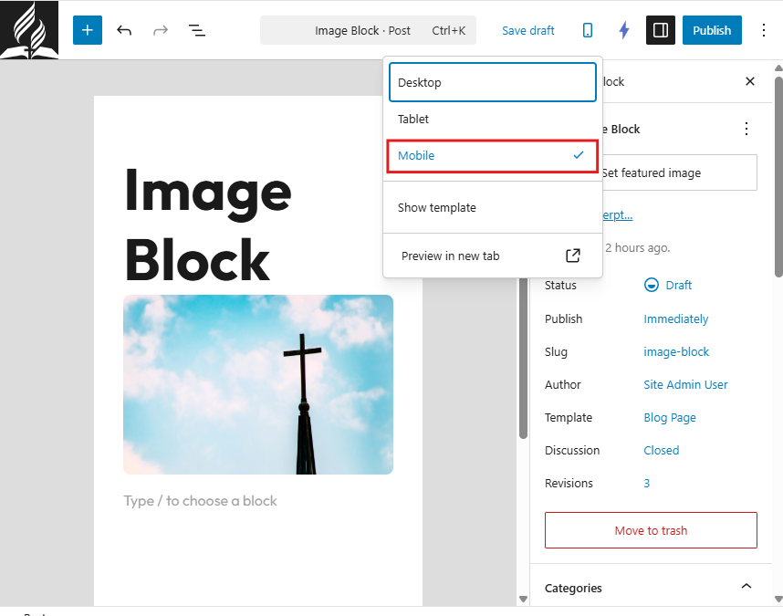
To preview mobile layout:
Open the page editor.
Click the Preview option.
Select Mobile view.
1. Optimize Images for Mobile
Large images are the most common cause of slow mobile performance.
Best practices:
Resize images before uploading
Keep file sizes under 300–500 KB
Avoid uploading raw camera images (4000px+)
Use JPG for photos
Learn more about optimizing images and tools to do so in
2. Keep Content Simple
Mobile screens are smaller. Clear, concise content improves readability.
Best practices:
Use short paragraphs
Break content into sections with headings
Avoid large blocks of text
Use bullet points when possible
Limit excessive animations or decorative elements
Simple layouts perform best on mobile.
3. Use Readable Font Sizes
Text should be easy to read without zooming.
Recommended guidelines:
Font size settings of small, medium, large, or xlarge that adapt to screen size
Clear heading hierarchy (H1, H2, H3)
Sufficient spacing between sections
Avoid very small fonts or tightly packed content.
4. Minimize Popups and Overlays
Large popups can interfere with mobile usability.
Avoid:
Full-screen popups that block content
Multiple overlapping banners
Hard-to-close overlays
Mobile users should be able to access content easily.
5. Reduce Page Clutter
Too many elements on a page can slow performance and overwhelm users.
Limit:
Excessive sliders
Large video backgrounds
Multiple embedded widgets
Too many columns in one row
Focus on clarity and priority content.
6. Test Before Publishing
Before publishing:
Preview the page in mobile view
Test on an actual phone if possible
Scroll through the full page
Check button spacing and tap targets
Buttons should be large enough to tap comfortably.
7. Improve Page Speed
Mobile users often rely on cellular data. Speed is critical.
To improve speed:
Optimize images
Avoid uploading large files
Limit unnecessary plugins
Use clean layouts
Faster sites create better experiences and improve search performance.
Mobile Optimization Checklist
Before publishing a page:
Images are resized and compressed
Text is easy to read
Layout adjusts properly in mobile preview
Buttons are spaced and tappable
No oversized banners or unnecessary clutter