
An update in early June of 2026 changed how the width of content on your Frame website works. This article will outline those changes and seek to explain how the width function works.
Summary of the Update
With this update paragraph and heading and similar blocks are wider across the page of the website. Also text in group blocks not will line up the same those not in Grouped blocks. Text content is being tied to the WordPress normal/content width instead being separate.
The Content Width is now set to 900px.
The Wide Width remains set to 1300px.
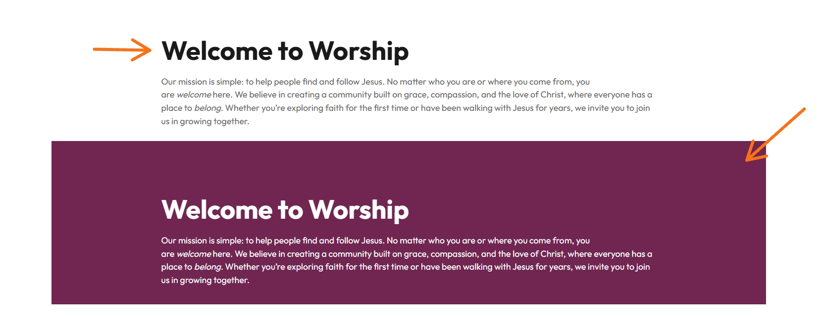
Now the inner blocks use content width inside a wide Group block, the 900px content column is centered inside the 1300px container. This maintains the centered look of the content and wider width with in Headings and Paragraph blocks.
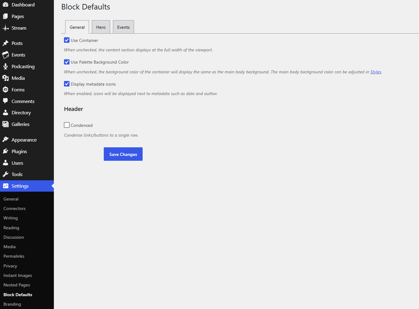
The old Block Evolves option for Center Content Region has been removed. This is because centering is now handled by the new Layout setting of the Content Width behavior. (Settings > Block Defaults, see image below)
For Only Advanced Users
Before and Reason for Update
Paragraphs, headings, and similar text content could be constrained by an extra max-width that was narrower than the intended WordPress content width.
This could make text lines appear shorter than expected inside a content region.
A separate Center Content Region option existed in Block Evolves to help center content that otherwise appeared offset.
The Set width for the website was set to Content With of 1200px and wide width was 1300px.
This could make text lines appear shorter than expected inside a content region.
A separate Center Content Region option existed in Block Evolves to help center content that otherwise appeared offset.
The Set width for the website was set to Content With of 1200px and wide width was 1300px.
With the Update
Paragraphs, heading and similar inner content can use the WordPress Content Width. Which is now set to 900px
The Wide width stays the same at 1300px.
Please do not adjust these settings for the site.
With the Update
Paragraphs, headings, and similar inner content can use the WordPress normal/content width.
When a wide Group block uses content width for inner blocks, the 900px inner content column centers automatically within the 1300px wide container.
This creates larger side gutters inside wide containers. That is expected behavior.
Full-width and wide containers still extend as before. The difference is how inner content is constrained and centered.
How to Manage this Going Forward for Grouped Blocks
Open a page.
Select the Group block or container block that controls the section.
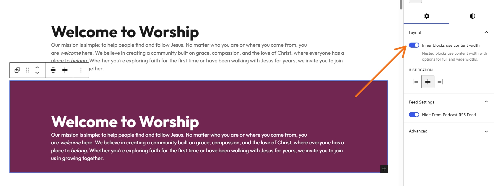
Open the right sidebar and go to Layout.
Use Inner blocks use content width when inner blocks should stay in the standard content column.
Disable or reset that control when inner blocks should extend across the wider container.
Expect some padding to remain for mobile/responsive purposes, even when a block appears wide or full width.
Takeaways
The spacing of Headings and text now extends wider across the page and is more centered for equal margins.
Grouped / nested blocks will need to be adjusted to full page width to match alignment of non grouped text. To alter this then the padding and margins will need to be adjusted for that block and the Layout button should be turned to the off.
This change applies platform wide as a default.